Guard eagle original or a copy?

Sandmann

Well-known member
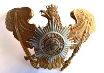
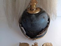
Dear fellow collectors,
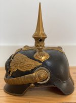
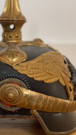
what do you think of this guard eagle, is it authentic or a replica (at least the eagle)?

Link to ebay guard eagle

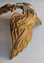
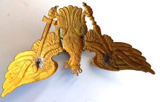
To me, it looks authentic, but according to Larcade, the ends of the fatherland banners on the replicas curl down/inwards, while on the original ones they curl up/inwards. Or do you think that only counts for enlisted men’s guard eagles?

My source is one of his personal folders, which was auctioned off along with many other parts of his collection:
IMG_5129.jpeg
 
To tell you the truth, Sandy, I don't like it much...
First and foremost, the scroll! Larcade was right. All mine have the ribbon curling upwards. Here is a general helmet, for instance. If variants were made the other way, I am not aware of it, but I strongly doubt it.
The threads look like modern replacements, with signs of re-soldering.
No matt finish (did it ever have one?) and I do not like the appearance of the metal.
Pictures of the Suum Cuique center are out of focus.

This is just my opinion, as always, but if I were you I would wish this plate a long life on Ebay...

L1060018 (2016_06_09 15_02_06 UTC).JPG
 
For beginners this is also a lesson I learned from, so always look carefully and if in doubt write it down here
👍
 
It seems that this topic has still not been analyzed sufficiently. I would never question the emblems shown by GardeUlan. However, since Larcade has certainly checked his thesis very carefully, I think that the rule applies at least to enlisted men's emblems!
There are indeed quite a few differences among the officers:
  • There are scepters and swords of very different lengths, some ends with the banner and others extends beyond it, or ...
  • The banner swing is sometimes stronger and sometimes less pronounced. Sometimes the last swing runs just below the upper edge of the wing, sometimes more centrally on the wing. Sometimes the top arch sits close to the inner edge of the wing, sometimes the distance from the inner edge is slightly greater (this applies to the grenadier eagle and the guard eagle without a star, with the word „Koenig“ on the eagle's chest).
  • The end of the banner is sometimes rolled up/inward, sometimes down/inward.
  • Sometimes the ends of the banner are rolled up, sometimes folded in an arch so that the end protrudes below the banner.
It therefore appears that, at least in the case of officer emblems, companies employed their own artists and pressed the emblems themselves using their own molds. Of course, this also goes for the enlisted men, but here the volumes of orders were so large that the differences are not so noticeable. Therefore, the designs are very different and other characteristics must be used to identify their originality.
Hopefully someone else is familiar with the copies from the 1970s that Larcade showed. I would like to see more photos of these old reproduction parts, but also of others.
 
Last edited:
It seems that this topic has still not been analyzed sufficiently. I would never question the emblems shown by GardeUlan. However, since Larcade has certainly checked his thesis very carefully, I think that the rule applies at least to enlisted men's emblems!
There are indeed quite a few differences among the officers:
  • There are scepters and swords of very different lengths, some ends with the banner and others extends beyond it, or ...
  • The banner swing is sometimes stronger and sometimes less pronounced. Sometimes the last swing runs just below the upper edge of the wing, sometimes more centrally on the wing. Sometimes the top arch sits close to the inner edge of the wing, sometimes the distance from the inner edge is slightly greater (this applies to the grenadier eagle and the guard eagle without a star, with the word „Koenig“ on the eagle's chest).
  • The end of the banner is sometimes rolled up/inward, sometimes down/inward.
  • Sometimes the ends of the banner are rolled up, sometimes folded in an arch so that the end protrudes below the banner.
It therefore appears that, at least in the case of officer emblems, companies employed their own artists and pressed the emblems themselves using their own molds. Of course, this also goes for the enlisted men, but here the volumes of orders were so large that the differences are not so noticeable. Therefore, the designs are very different and other characteristics must be used to identify their originality.
Hopefully someone else is familiar with the copies from the 1970s that Larcade showed. I would like to see more photos of these old reproduction parts, but also of others.
"The exception proves the rule."
Yes, there are many slight variations according to makers, individual craftsmanship, time period.... but some traits are fixed and specific of a given regiment or arm: sceptre, sword hilt, feather arrangement, shape of the scroll (to distinguish a Kurassier from an infantry eagle, for instance).
Regarding the current matter, I was curious and I checked a collection I know in Europe; 6 out of 6 general helmets with the scroll end curling upwards. Same in many Kube catalogues and at Weitze's, except for the convincing example shown by Garde Uhlan. Same with other merchants and collectors, Laine, my own examples... in aggregate, I have seen two or three (out of hundreds) with this different style of scroll curling. As of Larcade, his reference is from over fifty years ago. Those fake birds may have disappeared by natural selection...
I would conclude that the rule is what we have seen so often, although a different pattern of banner end curling downwards may be encountered in very rare occasions.
 
Just checked. I have 11 guard eagles, 6 officer and five em and all have the up-turned scroll. Interesting detail. Thank you for the information.

Ron
 
The pic's;
 

Attachments

  • Afbeelding van WhatsApp op 2025-09-15 om 09.03.37_3c5a3c2c.jpg
    Afbeelding van WhatsApp op 2025-09-15 om 09.03.37_3c5a3c2c.jpg
    119.2 KB · Views: 37
  • Afbeelding van WhatsApp op 2025-09-15 om 09.03.37_b6b78b97.jpg
    Afbeelding van WhatsApp op 2025-09-15 om 09.03.37_b6b78b97.jpg
    181.2 KB · Views: 39
  • Afbeelding van WhatsApp op 2025-09-15 om 09.03.37_d5d97b89.jpg
    Afbeelding van WhatsApp op 2025-09-15 om 09.03.37_d5d97b89.jpg
    216.2 KB · Views: 41
  • Afbeelding van WhatsApp op 2025-09-15 om 09.03.37_1bd1cb86.jpg
    Afbeelding van WhatsApp op 2025-09-15 om 09.03.37_1bd1cb86.jpg
    187.6 KB · Views: 40
  • Afbeelding van WhatsApp op 2025-09-15 om 09.03.37_ef1f04e1.jpg
    Afbeelding van WhatsApp op 2025-09-15 om 09.03.37_ef1f04e1.jpg
    42.8 KB · Views: 35
The pic's;

Very nice Kris. There might have been some copies made in the 60s or whatever, but your example is a high-quality stamping with a beautiful Garde star. Nothing wrong with that eagle.
Hey Tony, thanks for your input!
Everything seemed right to me too; crisp stroke detail, well elaborated edges, fitting the helmet well, the ghost on the leather, etc....
I just never noticed the difference with the scroll ends....
That is why we are here for! Learning every day ....
 
Back
Top